
Last updated on March 1, 2020
What Your Power BI Dashboard Style Guide Should Include
By Nathan Richard
In this blog, we discuss the elements of a style guide that will increase user adoption and take full advantage of the powerful design tools within Power BI.
User adoption is crucial to the success of any business intelligence (BI) implementation. A BI developer can create rich reporting that uncovers valuable insights, but if the data isn’t used to make business decisions, the analytics investment is made in vain. While many factors contribute to user adoption of your BI platform, there is one we find particularly important: a style guide. A style guide outlines the fonts, logos, colors, and design templates to help ensure all dashboards are cohesive in their look, feel, and use. How you style your data is key to unlocking its full potential. If all dashboards look and operate similarly, this can reduce the time it takes a user to process information, making it easier for them to uncover insights.[Watch our Webinar: Communicate Data with the Right Visualizations]
Uniform style promotes the adoption of analytics
Having a style guide makes it easier for developers to create cohesive apps and enhances the end-user experience. In our project delivery experience, style guides promote quick time-to-value dashboards and increased overall trust from our end users upon delivery.Developing a BI Style Guide:
Basic Design Elements
Your Power BI dashboard style guide should outline how and when to use the following elements. (Your Marketing team will likely have branding standards for many of these elements.)- Font: If a company standard does not exist, Arial or Calibri are good, easy-to-read universal options. Outline which fonts to use and how (for example, specific font and style for headings, main content, chart descriptions, etc.)
- Colors: The RGB or CYMK codes for company colors can be added to theme settings in your BI tool. If there are no company standards, start with the logo to choose the same colors (websites like https://imagecolorpicker.com/ can help you color match).
- Logo: It’s important to use your company’s logo consistently when creating dashboards (using the logo without changing the colors, proportions, background, format, etc). The style guide should determine what logo to use, where to place it, the dimensions, etc.
BI-Specific Standards
Power BI Dashboard elements should also be defined:- Dashboard layout, such as page title and button location
- Placement of prominent KPIs
- Filter location (or whether to use Power BI Filter Pane)
- KPI Specifics: Max per page, location, decimals, etc.
- Chart Specifics: Max per page, location, decimals, etc.
- Acceptable Charts: Which charts you should and shouldn’t use (many industry professionals strongly dislike the use of Pie charts and Treemaps)
- Chart-naming conventions
Power BI-Specific Customizations
Power BI design themes are a powerful feature that allows for reusable customization of company-wide design standards. Power BI themes and templates promote consistency of deliverables in an efficient manner. When using themes and templates, a developer will no longer have to customize the settings of each dashboard.- Set a Theme: Power BI allows you to customize themes and export them as a template for easy sharing. When customizing a theme, you can go beyond basic design standards and define the appearance of more specific things like graphs, KPIs, and filters. Some examples of standards you should define include the use of gridlines, background color for charts/KPIs/filters, and borders. A good starting point is to reference your most utilized dashboard to take inspiration on what elements work well.
Some tips when setting a theme:
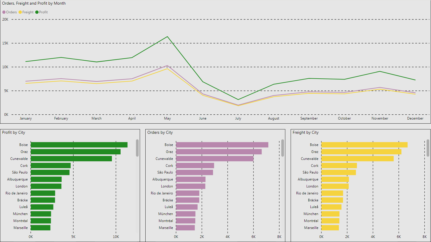
Pick one core KPI and a few secondary metrics to build reports around: In this example, we built all of the reports around one core KPI and a few secondary metrics. We represented the core KPI in the same color (green) so users always associated this color with the same metric, regardless of what report they were in. The secondary metrics were always represented in purple and yellow to create the same effect. Then we used a light gray background with a black border for the full suite of reports. Every report we built for this client followed this same design layout to give some continuity regardless of the report a user was accessing.
Using color to demonstrate primary and secondary KPIs
Start with basic visualizations before adding more advanced ones: We picked a few core, basic visualizations to start with so users got comfortable seeing the data represented in the same way. As users got more comfortable and competent using a few distinct visuals (scatterplots, bar charts, time trends), we were able to introduce more advanced visualizations (Q&A visuals and Natural Language Generation boxes) and more feature functionality (drill through and customized tool tips). While they might look cool, bombarding users with a bunch of advanced visualizations out of the gate usually is just confusing and leads to poor user adoption.
To enable customized themes in Power BI, go to Options and settings ⇾ Options ⇾ Preview Features ⇾ Check box Customize current theme, and then restart Power BI.
To start customizing your theme, click on Switch Theme on the top ribbon and navigate down to Customize current theme. From there, you can make your selections.
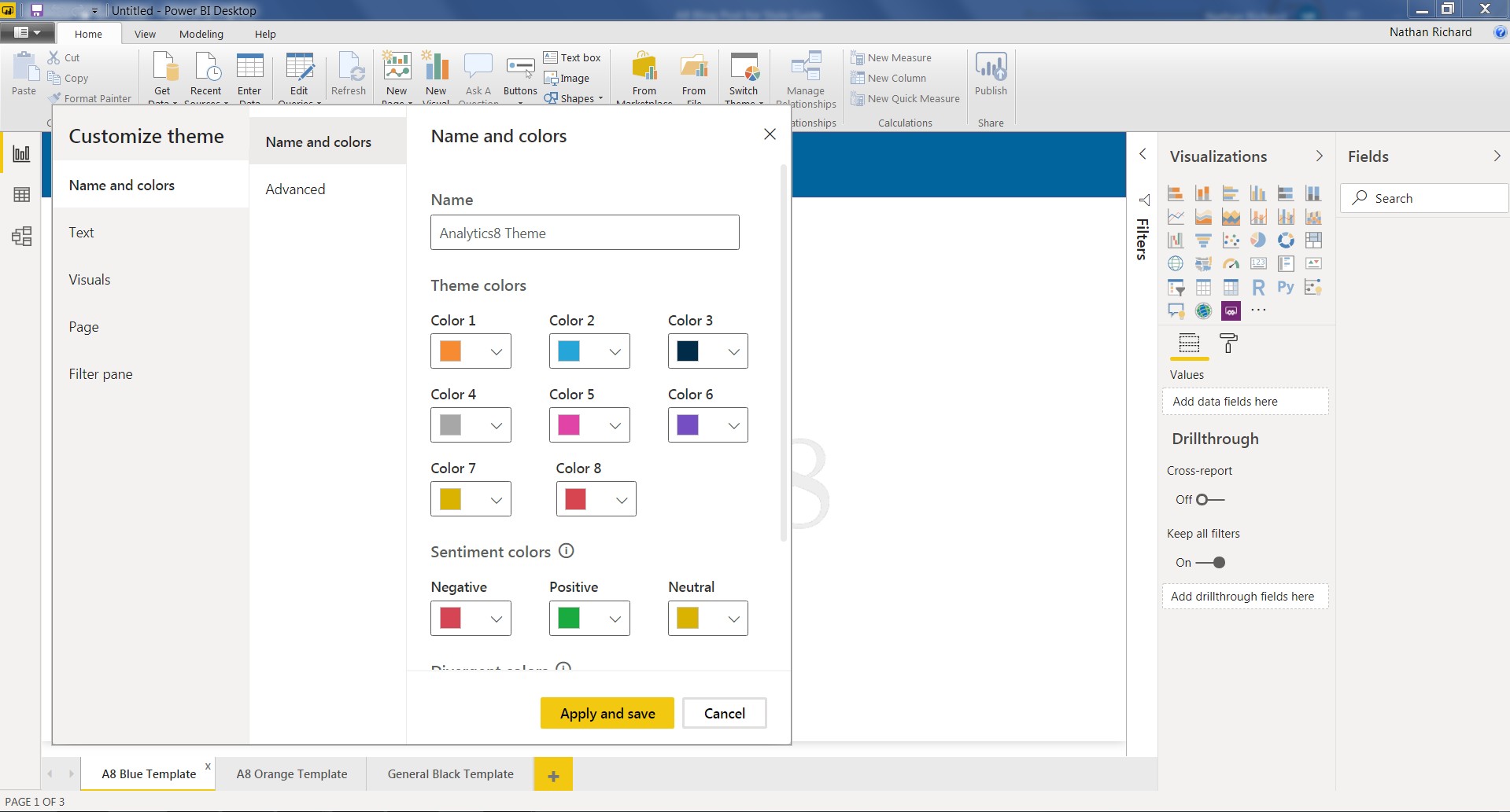
To export, under the same tab (Switch Theme), you will see the option to Export current theme.
- Create a Template: Similar to creating a Power BI theme, you can also create a template that allows you to package pre-made pages and use them as a starting point for new dashboards. All the different pages should generally have the same layout so as not to be confusing to a new user, but changing colors or the placement of logos is fine as long as the changes are minor. Note: A PBIT (Power BI Template) file only keeps the structure of the dashboard, not the data.
After creating your template, export the template by navigating to Export ⇾ Power BI template. When uploading a template to use to start developing, the theme will also transfer over. This means you should match the theme to the JSON file by importing the theme you created, so there is theme uniformity between the JSON and PPBIT file.
Put Focus on Doing More with Data
With style guides in place, developers no longer design dashboards at random, and they can focus on creating cohesive apps that improve user adoption and experience. Dashboards designed for the business user will help you discover new patterns, identify key relationships, share ideas, and explore new possibilities.Talk With a Data Analytics Expert
Key Takeaways
- User adoption is critical to BI success, and a consistent visual experience through style guides helps encourage regular use of dashboards.
- A BI style guide should define design standards such as font usage, color schemes, logo placement, and layout to ensure a cohesive user experience.
- Standardizing dashboard elements like KPIs, filters, and chart types makes it easier for users to interpret and trust data across different reports.
- Power BI themes and templates promote consistency and efficiency by allowing developers to reuse styling elements across projects.
- Using color coding to differentiate between core KPIs and secondary metrics helps users associate meaning quickly across reports.
- Starting with basic visualizations builds user confidence and lays the foundation for gradually introducing advanced features.
- Templates (PBIT files) and JSON-based themes should be aligned to maintain uniform design and streamline dashboard development.